CAMBIO
CAMBIO is a secure, transparent, and user-friendly currency exchange and transfer app that helps global travelers and digital professionals send, receive, and convert money at the best real-time rates. With built-in rate tracking and instant transfers, CAMBIO makes global finance simple, fast, and fair.
Role: Project Manager, Designer
Duration: 3 Weeks, Decemeber 2025
Project Vision
CAMBIO’s goal is to become a trusted global financial tool by providing a secure, transparent, and user-friendly way to exchange and transfer money across borders. Designed for global travelers and digital professionals, CAMBIO empowers users to send, receive, and convert currency at the best real-time rates with confidence. Through built-in rate tracking and instant transfers, CAMBIO simplifies global finance, making it fast, fair, and accessible for everyone.
Kickoff
In this project, I took a goal-directed design approach to create CAMBIO. By grounding each design decision in user needs, stakeholder objectives, and real-world financial challenges, I was able to move intentionally from research to ideation and into high-fidelity mockups. This process ensured that every feature, from real-time rate tracking to instant transfers, was designed with both usability and trust at the forefront. I answered several questions to ensure this was possible.
What is the product, and what core problem does it solve?
Who is this product designed for?
Who are our primary and secondary users?
What do our primary users need most when exchanging or transferring money?
What pain points exist in the current market?
What motivates users to choose one financial app over another?
What are the most important tasks users need to complete quickly and confidently?
How do we ensure the product is accessible and inclusive for all users?
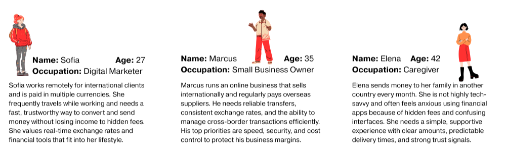
User Personas
Building User Trust in a Competitive Market
Regulatory and Compliance Barriers
Managing Real-Time Exchange Rate Accuracy
Ensuring Strong Security and Fraud Prevention
User Experience vs. Feature Complexity
Challenges
Competitive Analysis
The competitive analysis revealed a fast growing market with both fintech innovators and traditional remittance services offering similar features. While many competitors excel at global reach, gaps still remain. With CAMBIO users can exchange currencies and send money to friends or small businesses within the same app. This makes CAMBIO stand out in personalization, predictive tools, and accessibility-focused design. These insights helped position CAMBIO to differentiate itself through a more user-centered, transparent, and intuitive experience tailored to modern global users.
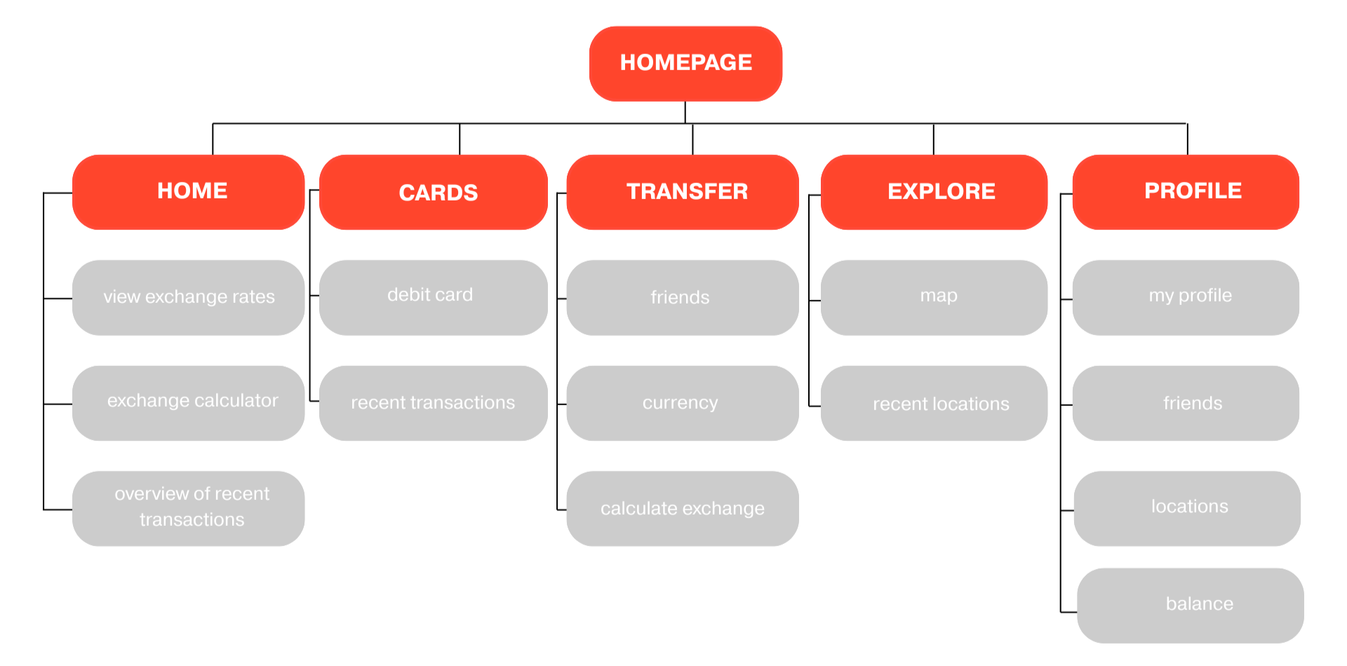
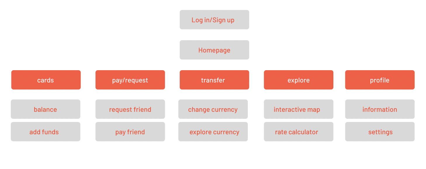
Preparing The Journey
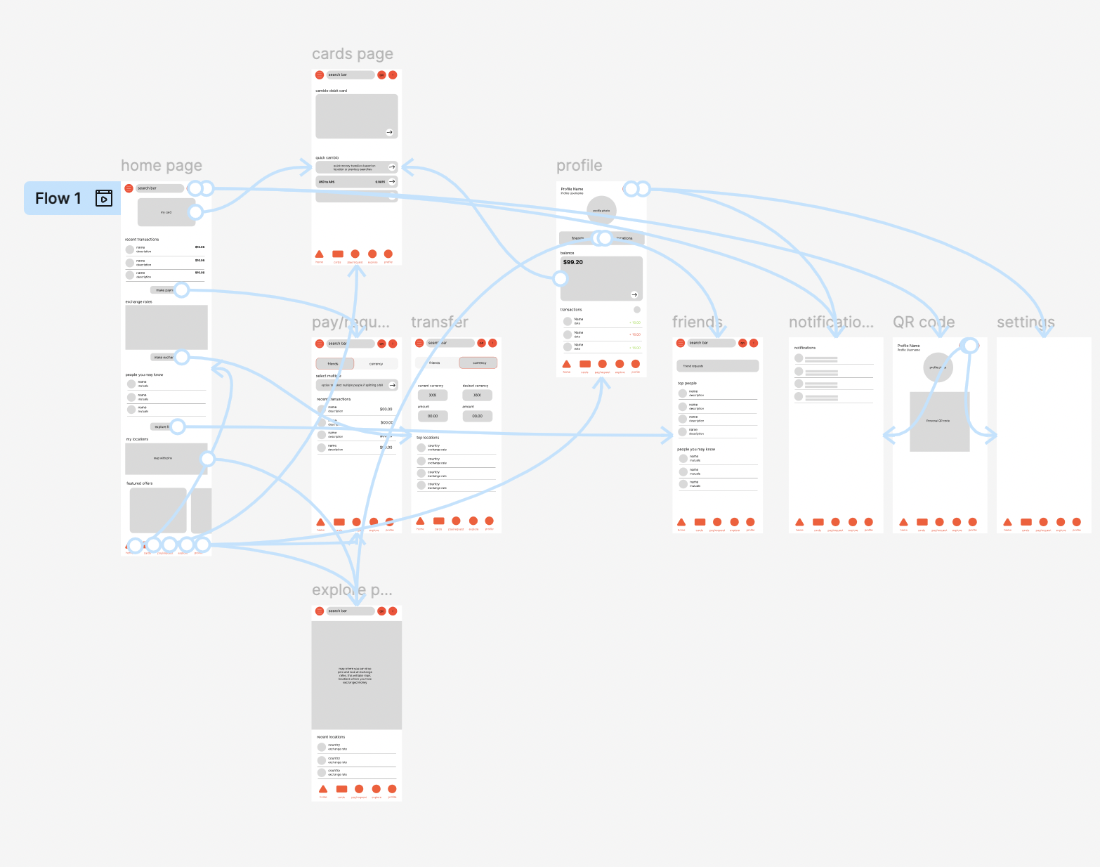
Iteration
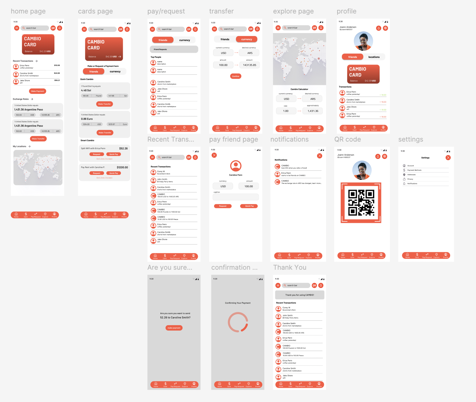
This didn’t happen overnight … iteration played a critical role in refining CAMBIO’s design by allowing insights from usability testing and feedback to directly inform improvements. Through multiple rounds of revisions, I simplified key user flows, strengthened visual hierarchy, and clarified core actions like switching between currencies and receivers. This iterative process ensured that each design decision was driven by real user behavior and continuously improved usability and clarity.
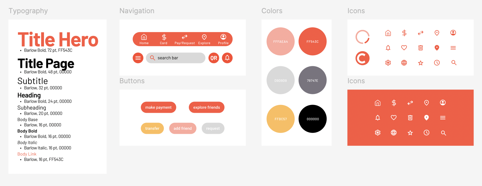
Style Guide
The style guide for CAMBIO was developed to ensure visual consistency, accessibility, and a cohesive brand identity across all screens. It establishes clear standards for typography, color palette, spacing, iconography, and button styles to support usability and trust. By following this guide throughout the design process, I was able to maintain a polished, intuitive interface while ensuring the product remains accessible and easy to navigate for all users.
Takeaways
Designing CAMBIO taught me how important it is to set aside assumptions and let research drive design decisions. The competitive analysis showed me just how crowded the fintech space is, which challenged me to think critically about how to stand out. I gained a deeper appreciation for accessibility and transparency throughout this process, realizing that in financial products, clarity directly impacts trust and confidence.
Iteration pushed me to become more flexible as a designer. For instance, learning to let go of ideas that didn’t serve the user and refine the ones that did. Creating and following a style guide helped me understand how consistency strengthens both usability and brand identity. Overall, this project helped me grow not only in technical UX skills, but also in designing with greater empathy, intention, and strategic thinking.
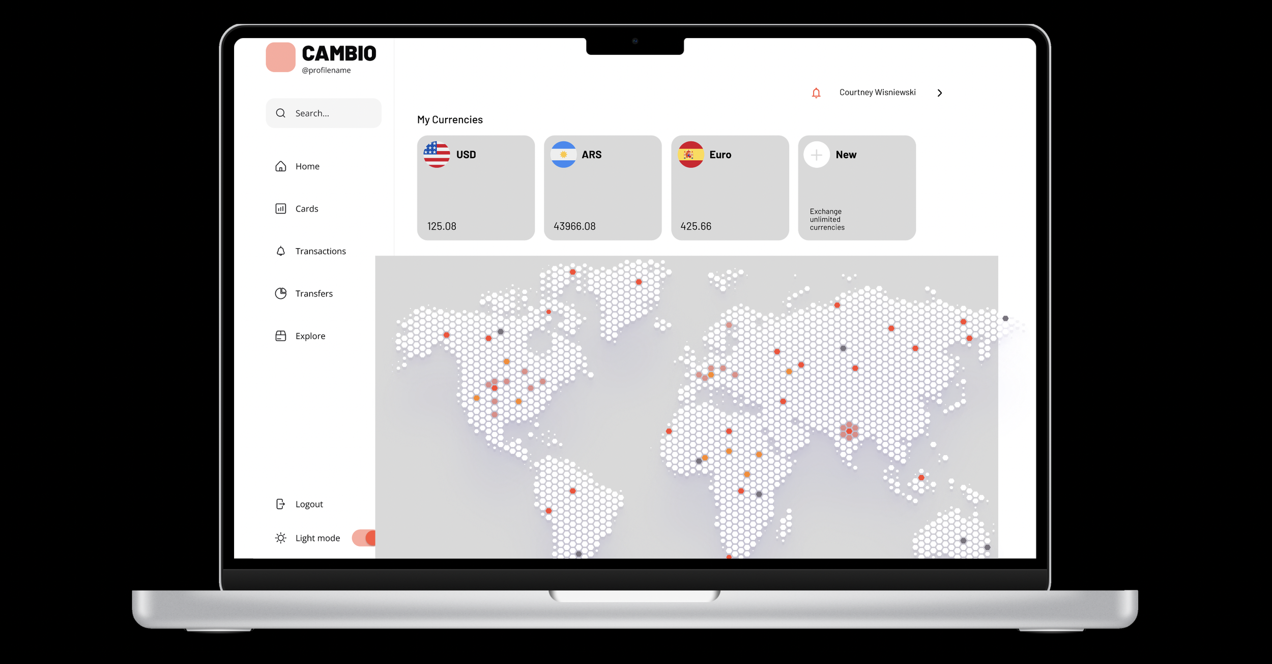
Moving Forward
Research shows that some users still prefer to use their desktop, especially when it comes to finances. Going forward I will be working on designing a web page to access finances, profiles, and settings.